User Test Results
Test 1
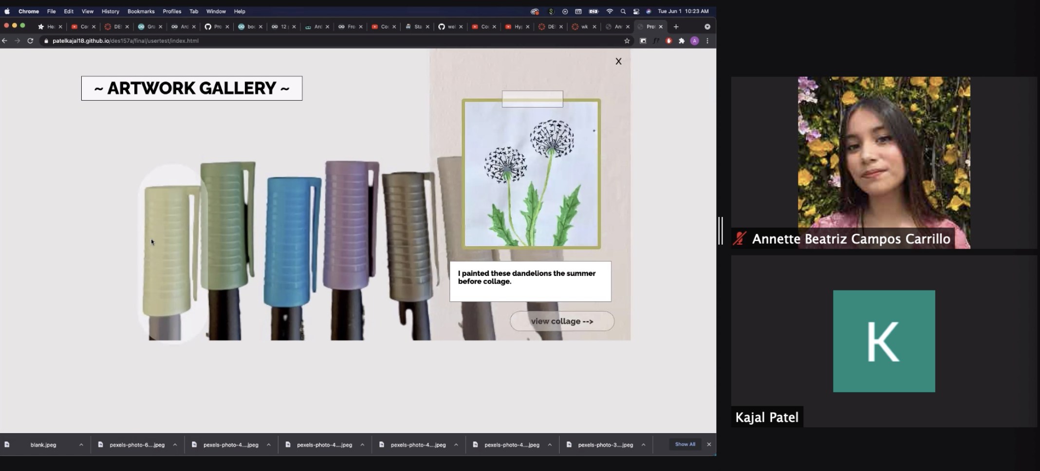
My first user test was with Annette. She conveyed that the overall theme of my project came across well and understood what to do at each screen. She also mentioned that the design was cohesive throughout every screen. A suggestion she had was to include back buttons for every page since right now you have to refresh the page to return “home”.
Another suggestion was to change the color of the “I’m Feeling Lucky” button and have it fill the entire square to match the design of the collage screen. Overall, she took the functionality was easy to figure out and gave new insights on the design.

Test 2
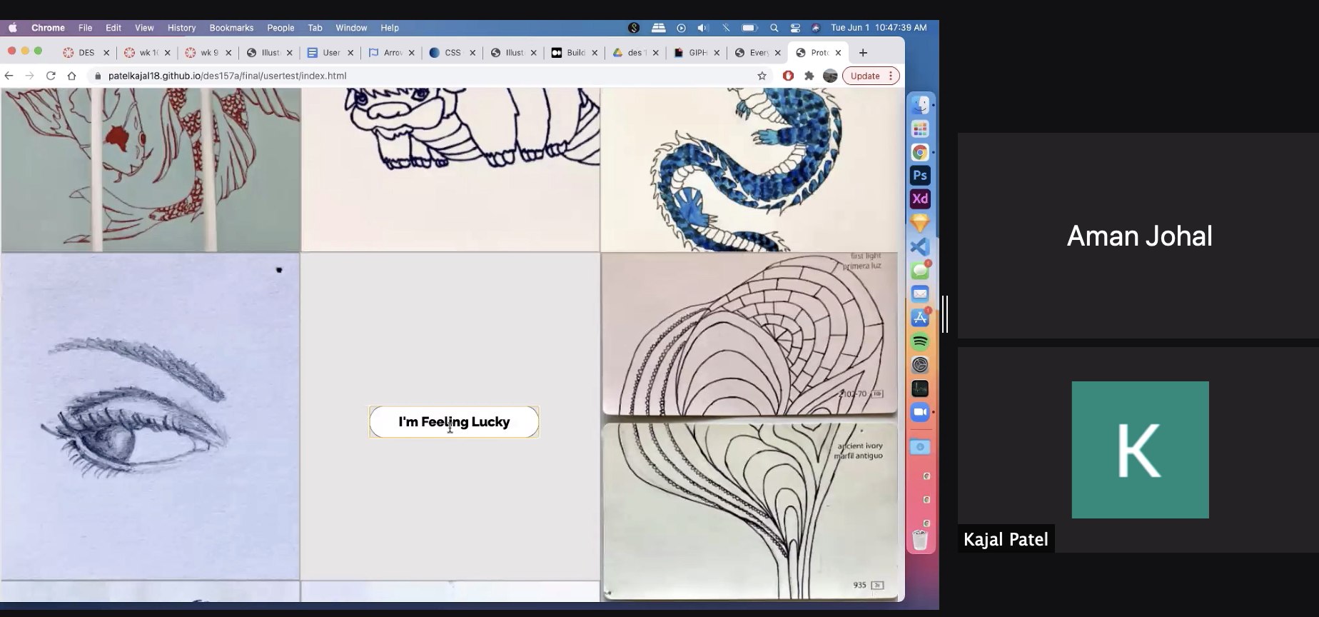
The second user test was with Aman! He also thought the overall theme made sense and liked the organization of squares in the collage screen. Also, he thought the website functioned and was sized well. A suggestion was to incorporate the square pattern from the collage into the first screen with pens.
Another suggestion was to add the descriptions from the overlays on the first page to each picture on second page. I really liked this idea because user would still be able to interact with each image in the collage too. Overall, Aman seemed to easily browse through the website and had some minor additions to the design.

Test 3
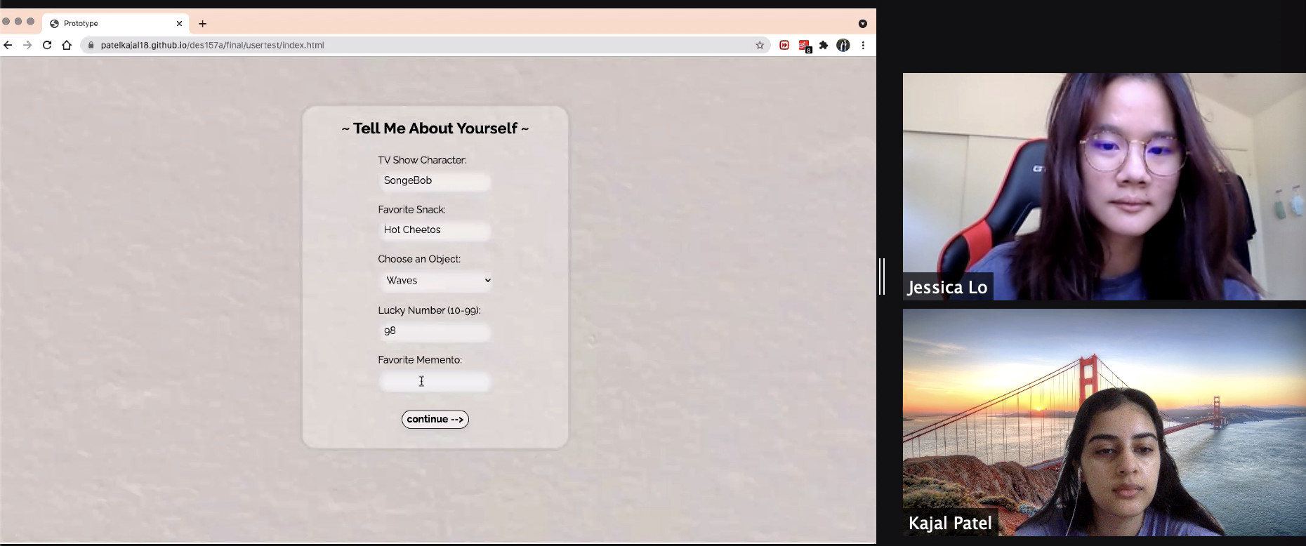
The third user to test my project was Jessica! She thought the magazine cover at the end of project disrupted the website’s theme. Her suggestion to change the background of the cover to another drawing I had instead of the scenery pictures. Also, she thought the design tied together pretty well and the matching buttons helped a lot. A suggestion she had was to hide the “view collage” button when the overlay appears because the user might try to click it.
Another suggestion was to change the title of the form from “Tell Me About Yourself” to something about adding to the collage so the user isn’t confused about the connection to the project. Overall, Jessica had great insights for me and helped me improve the design.
